One of our readers commented on the tutorial about responsively hiding elements in Elementor raising a great question: what if you don't just want the element to be hidden - what if you wanted to prevent an image from even loading on mobile.
With most methods of hiding elements for mobile, you're just assigning this code to the element:
display: none;That literally only stops the browser from displaying the element.
The problem comes if you have a large image that you're trying to hide.
The browser will still load the image. It just won't be seen. But it adds to the "weight" of the page and will negatively impact the page load speed.
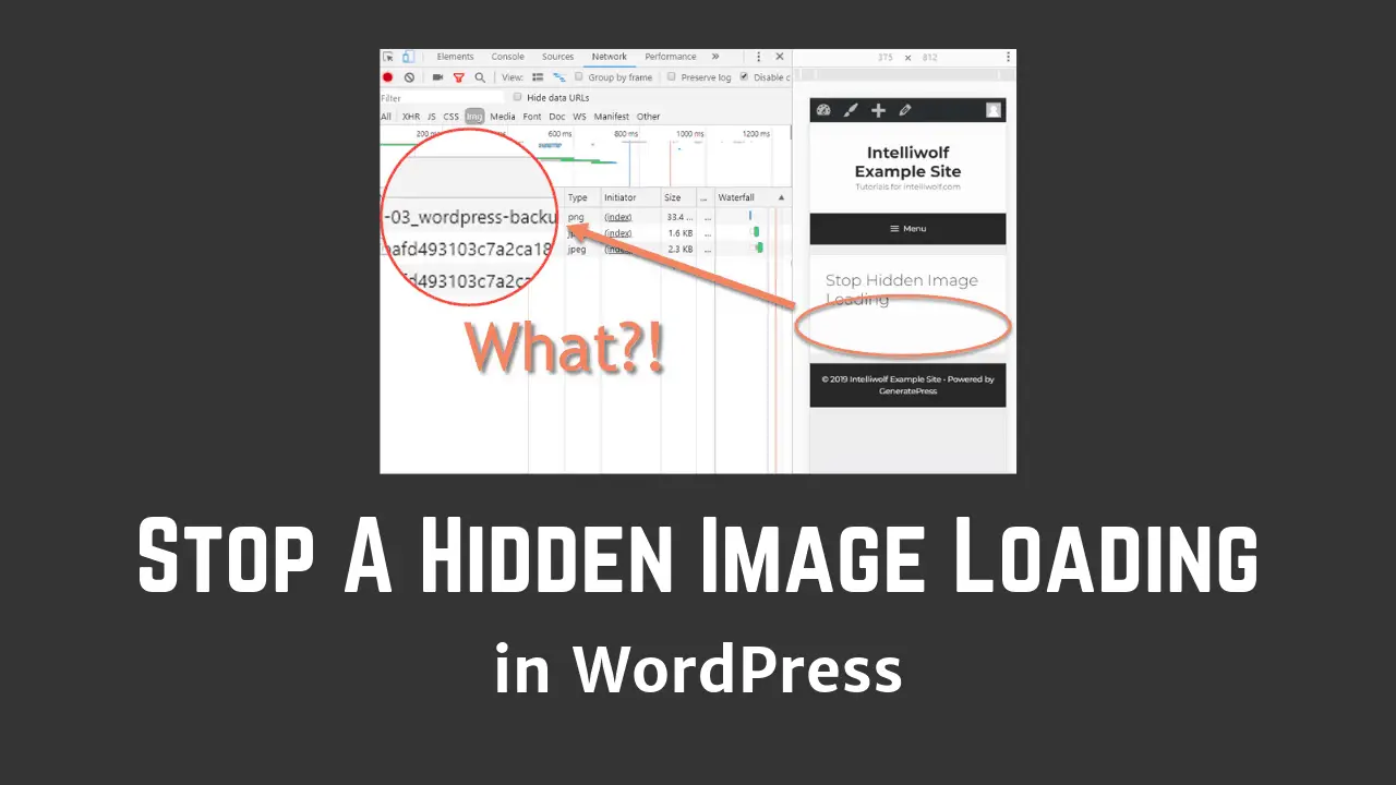
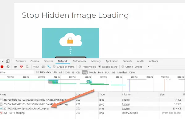
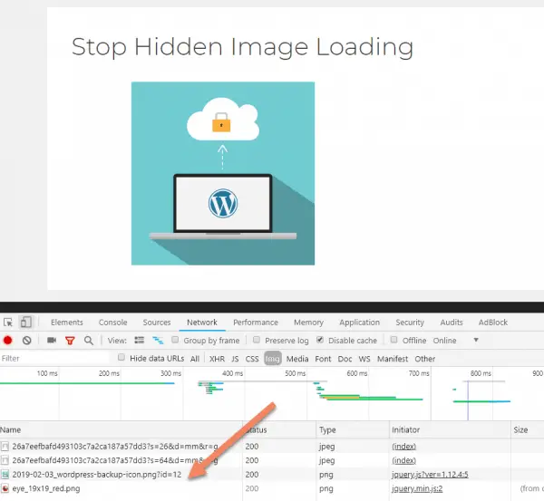
Here's what I mean:
See how the image above is not visible on a mobile size? I've circled where it appears on larger browser sizes.
Now look at the bottom of the graphic where the files that are loaded are listed. That png is what's hidden.
If you're just talking about a couple of kilobytes, that's no big deal.
But if the hidden image is a megabyte or more, you probably shouldn't be loading that on mobile.
Unfortunately, browser technology still has a way to go.
To stop a hidden image loading on mobile (or any specific screen size), we need to get a little creative.
Thankfully it's usually not too difficult to do in most page builders.
How to prevent a hidden WordPress image from loading on mobile:
- Create an area to hold the image
- Set the image as a background image of that area
- Set a parent of that area to "display: none;" on mobile
See below for the steps in various page builders.
What's the principle behind preventing the downloading of a hidden image on mobile?
Ordinarily, we bring in images using the <img> tag. Even if the display is set to "none", the browser will still try to download the image.
Instead, we create a box and set the image as the background.
If you set a parent of that box to display: none; then the browser won't try to load the image.
It's a bit hacky, but it's the best we've got in the circumstances.
If you're doing this without a page builder, you're probably better off setting a class on the box, then responsively setting the background-image to "none".
That's what we'll have to do in the example with Divi.
The other page builders on this page have the responsive hiding attached to a parent of the box, but Divi attaches it to the box itself. A little annoying, but I'll show how to get it done.
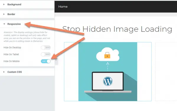
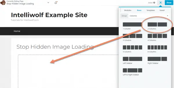
How to stop Elementor loading a hidden image on mobile
First we need to create an area to hold the image.
Maybe a little counterintuitively, we're not going to use the image widget for this.
We're going to use the spacer, so we can control the height of the image.
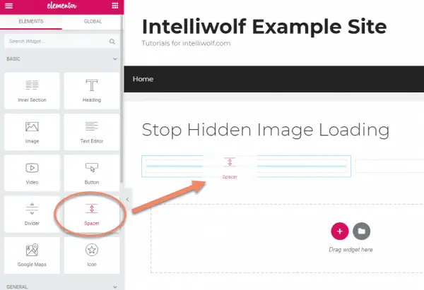
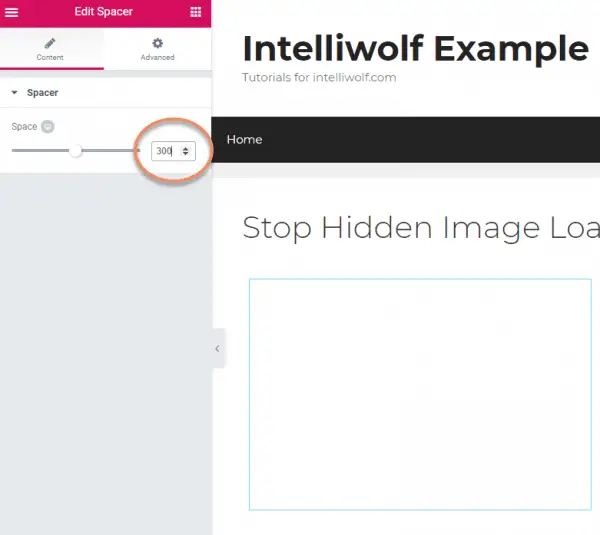
Set the height to 300px, or whatever height you want the image to be.
We're actually adjusting the height of a blank container for now. The image will be the background of this container.
With this method, we lose the ability to easily keep the width from being too wide for the height. This will make more sense in a couple of steps.
If the image ends up not looking right, come back to this step and adjust the height.
Switch to the Advanced tab, open the Background accordion and click the paintbrush icon.
This will open the Image block. Click that.
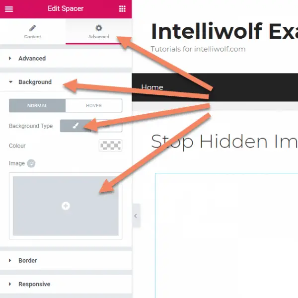
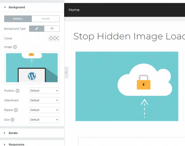
Choose your image for the background.
You'll return to something looking like this.
Notice the image is zoomed all the way in on the right? We'll fix that next.
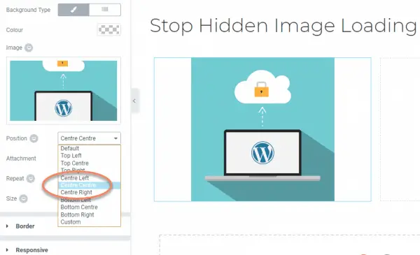
Set Position to "Centre Centre", Repeat to "No-Repeat" and Size to "Contain".
Contain will automatically change the image to be displayed completely inside the spacer, instead of being zoomed in. You may have to play with sizes to get it to look the way you want.
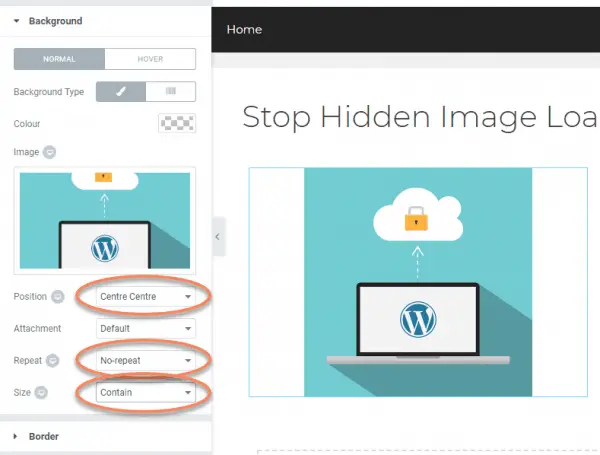
If you want a left-aligned image, change the Position to "Centre Left". Change it to "Centre Right" for a right-aligned image.
The last step is to open the Responsive accordion and choose "Hide On Mobile". Then click "Update" to save.
On the front end, our image still loads the way we want on desktop.
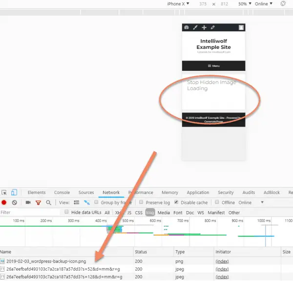
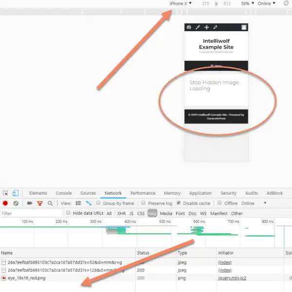
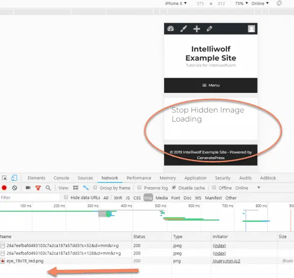
When we switch the size to mobile and reload the page, the image is hidden from the content.
If you look at the bottom of the graphic, you can see that the image is no longer loaded by the browser.
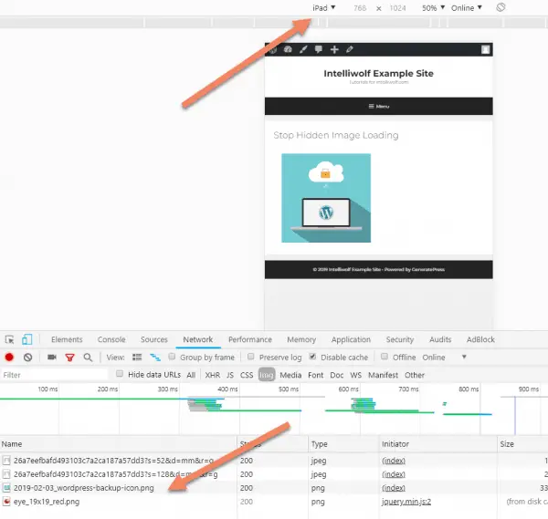
It still looks the way we want on a Tablet, and is still being loaded.
How to stop Beaver Builder loading a hidden image on mobile
It's even easier to stop Beaver Builder loading a hidden image on mobile that we did with Elementor.
This is because Beaver Builder has the ability to easily set the column height.
Let's load up our columns.
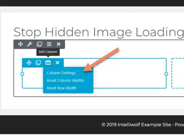
Hover over the column where you want the image.
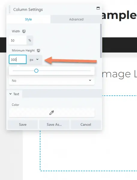
Click Edit Column, then Column Settings.
Set the height to 300px or whatever height you want the image to be.
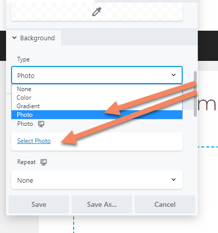
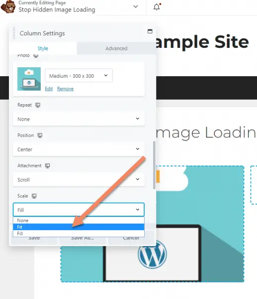
Scrolling down, set the Background Type to "Photo".
Click "Select Photo" to choose the image.
You can set a different size (I did Medium for this) if it works better.
Change the Scale to "Fit". This is the same as "Contain" in Elementor.
The other settings you can leave as default.
You might want to change the Position if you want a different alignment.
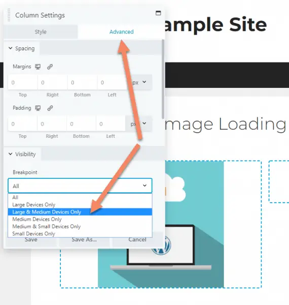
Switch to the Advanced tab then under Visibility, set the Breakpoint to "Large & Medium Devices Only". This will hide the image from mobile browsers.
Be sure to save the page.
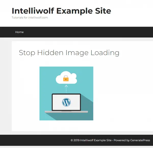
The image loads as expected on Desktop.
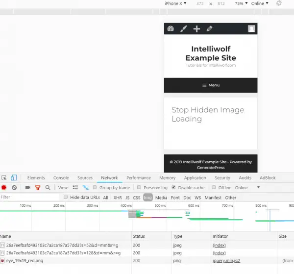
The image is hidden from the content on mobile. The image is no longer loaded in the browser.
How to stop WPBakery Page Builder loading a hidden image on mobile
The steps for preventing a hidden image loading in WPBakery Page Builder are pretty much the same as for Beaver Builder and Elementor.
We'll start by adding a Row.
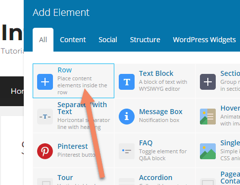
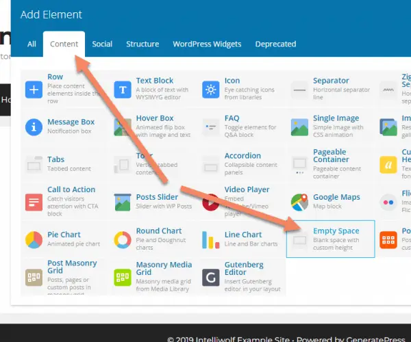
Click "Add Element".
Select Row.
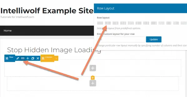
I'll change the Row Layout to two columns, to stay consistent with the other examples, but you do whatever layout works best for your design.
Click the grey "plus" button to add an element inside one of the columns.
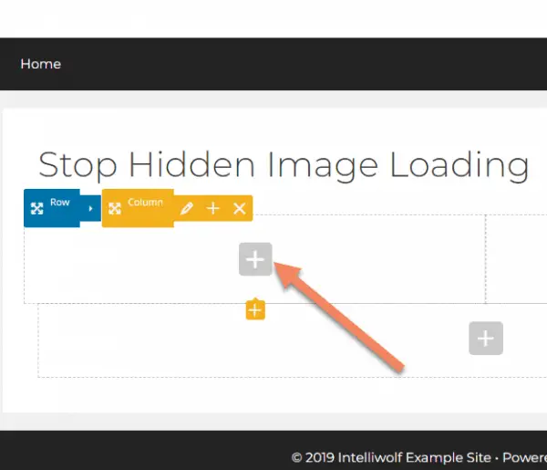
We're looking for the Empty Space element. You can find it under All or under Content.
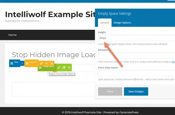
Set the height to 300px. This will be the height of the image in your design.
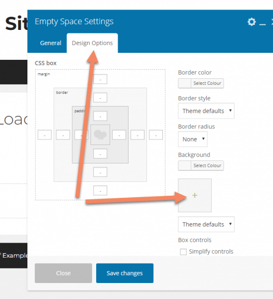
Choose the Design Options tab, then click the box for background images.
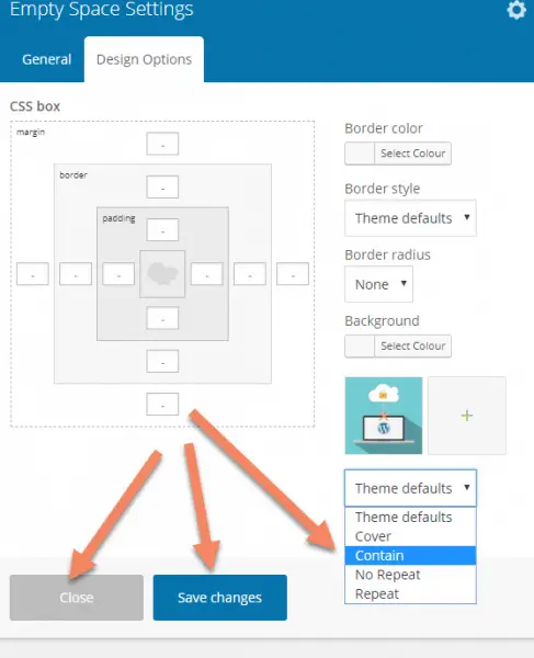
Once you've chosen your image, change the background from "Theme defaults" to "Contain".
Save changes and close the popup.
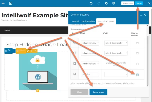
Hover over the image and click the pencil icon next to Columns to bring up Column Settings.
Switch to the Responsive Options tab, then check the box for Hide on device for mobile. You can hide it on other sizes too if you need.
Save changes, then update the page.
If you go to the page, you'll see the image looking as it should.
The image will be hidden on mobile and the browser will no longer load the image.
How to stop Divi loading a hidden image on mobile
Unfortunately, stopping Divi from loading a hidden image is a little more complicated than for the page builders I discussed above.
The problem is that Divi applies the responsive hiding to the same div as it applies the background image.
We still have to use a Divider module, rather than an Image module.
Read more about what we're doing and why in Principles, above.
Start by inserting a two-column row.
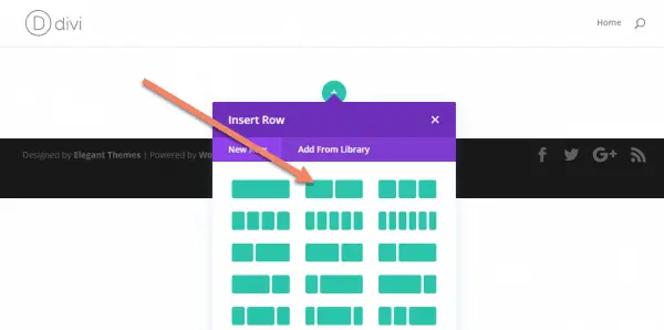
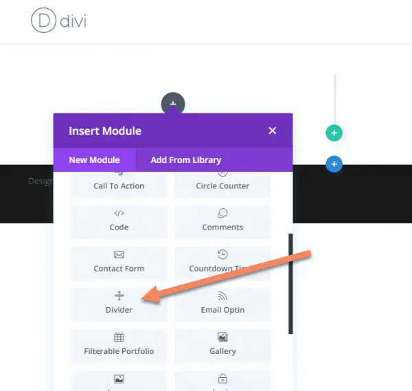
Insert a Divider module.
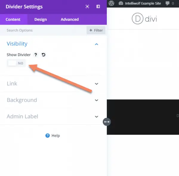
Turn the divider line off by switching Show Divider to "NO".
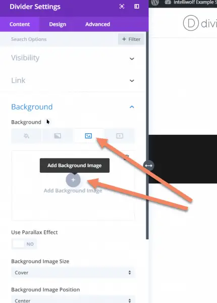
Open the Background tab, choose the image background and click the plus icon to add a background image.
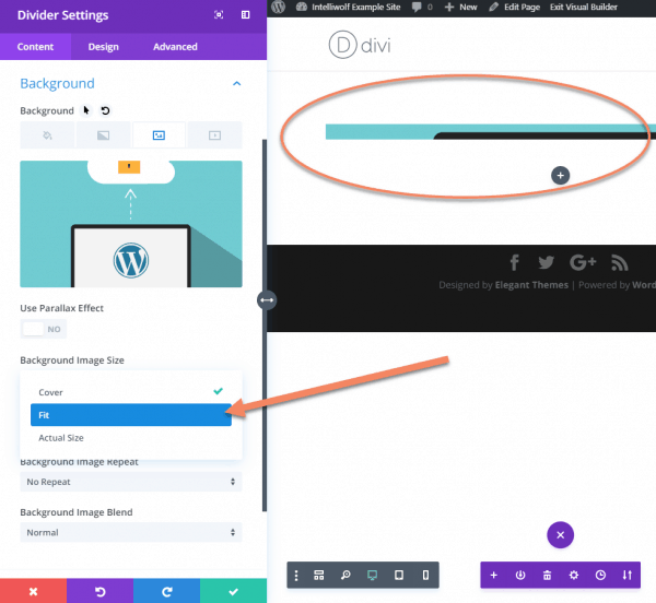
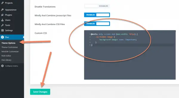
Once you have your background image, change the Background Image Size to "Fit". Otherwise it will look strange like in the circled section.
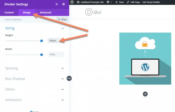
Still in the Divider Settings, switch to the Design tab and change the Height to 300px.
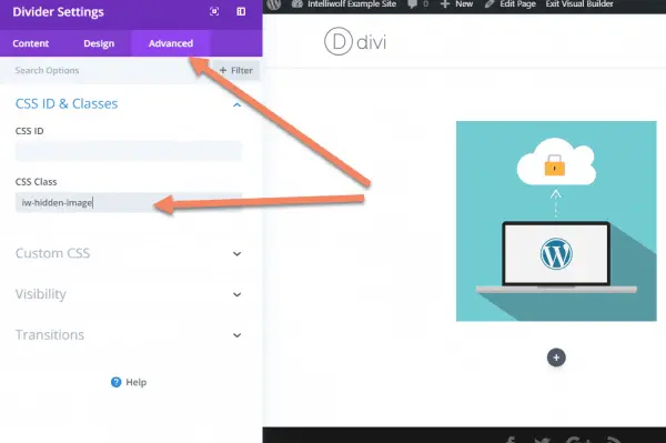
Switch to the Advanced tab and add a class for your hidden images in CSS Class.
I've used "iw-hidden-image", but you can use anything that's not otherwise in use on your site.
For classes like this, I like to use the initials of the site (in this case "IW" for "Intelliwolf"), followed by an easily recognizable description.
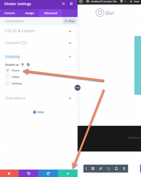
Still on the Advanced tab, open the Visibility accordion.
Check Disable on Phone.
Save the settings and the page.
This is where the steps for Divi diverge from the other examples.
If you pull up the page on mobile, the image isn't displayed, but it's still being loaded.
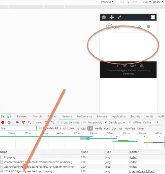
To fix this, we'll need to add some custom CSS to Divi.
In the WordPress Admin area, go to Divi -> Theme Options.
Scroll all the way to the bottom of the General tab (which should be automatically selected) until you see Custom CSS.
In the Custom CSS box, add this code:
@media only screen and (max-width: 767px) {
  .iw-hidden-image {
    background-image: none !important;
  }
}
Change .iw-hidden-image to the class you chose for the Divider above. Make sure to add the period at the start.
What this does is forcibly remove the background image on screens 767px wide or less.
Because we used a class rather than an ID, you can apply this class to any other images you don't want displayed on mobile.
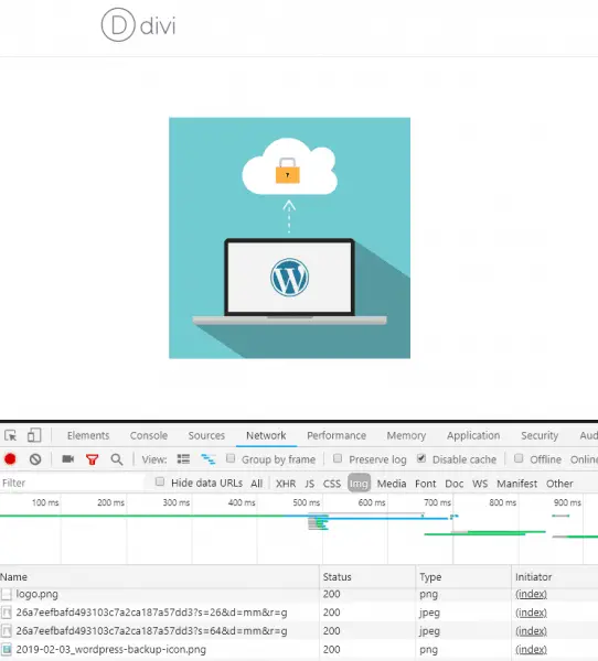
Now when we pull up the page on mobile, the image is no longer loaded.
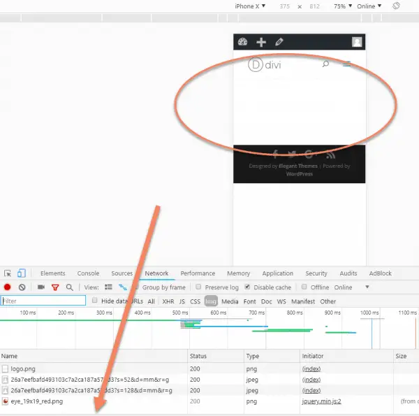
But it's still displaying correctly on desktop.

hi there,
Great work.
I am using Divi. I am just wondering if I am using 2 slide modules, one on mobile and one on the desktop. What can I do, in order to Stop A Hidden WordPress Image Loading On Mobile?
Thank you! Exactly what I was looking for! xxx
Thanks for this! I just wondering if I was the only As far as I'm concerned for the hidden image loading on mobile...
is there a way to do this for sections? I have smart slider on desktop but its still loading the images it uses in mobile. I have disabled the section/column/widget from mobile on elementor and smart slider but I can see it's still loading. Any advice?
Hey Mike. It depends how the slider is pulling in the images. If it's doing it with![]() then it's going to be difficult because of the issues I laid out at the top of this post. If it's done by jQuery, then maybe there's a way to reorder the image load til after it checks screen size, or disable the load completely.
then it's going to be difficult because of the issues I laid out at the top of this post. If it's done by jQuery, then maybe there's a way to reorder the image load til after it checks screen size, or disable the load completely.
The problem is that if the image url is in the code, the browser will try to download it. It's just trying to be helpful, but not in this case.
Another option might be to try to swap out the images for a tiny one pixel image on mobile. It's not the best solution, but that'll decrease the load.
Thanks for this guide! Any tips for preventing a video from being loaded on mobile with Elementor? I think that's an even bigger challenge. I want the videos to load on desktop but want a static image to load for mobile.
If you're talking about a self-hosted video, I would probably design the page to have an image by default, then switch it out with jQuery.
If you're talking about say a Youtube or Vimeo embedded video, I'd just build that section twice, once with the video, once with the image. Then selectively show the video to desktop but not mobile and vice versa for the image.
Unlike an image, the video won't download unless it's on autoplay or someone hits "play". You might have some additional calls to scripts as with any video, but if that's an issue, just go with the jQuery solution.
Hello, nice post but it's very very bad for seo as background images are not indexed by google. Is there another way by preserving the seo ?
Thanks
With Google's mobile first indexing, if you're hiding an image from mobile it probably shouldn't be indexed by Google anyway. I know there are a lot of theories about the ways you can meta tag image and make them help your SEO efforts, but none of my tests have shown that to actually help. At best, it's maybe a couple of a percent bump. For all that work, you're better off writing another super useful article or improving what you've already got.
Hello,
Thanks for this solution, but in my case, i get to see a blank space and text below it. How can i move the text above the hidden image and make the UI much better.?
Hiding rows with anything in them for mobile does this same thing it seems. It creates a space that I can't do anything with. Is there a fix for that so that there isn't some big chunk of area where the hidden elements are apparently located?
You may need to play around with the styling or apply the code to a higher level than the element itself.
I am using wpbakery by the way.
I am using Gutenberg. Meanwhile, how do I hide author bio title in Astra pro theme please?
This tutorial should help: https://intelliwolf.com/customize-post-meta-astra/
Just hide it in Theme Customizer -> Blog -> Single Post
I'll buy you more than a coffee if you can make this same technique work with background VIDEO. Specifically self hosted webm video as background in an image module.
Just use Elementor. It does this automatically.