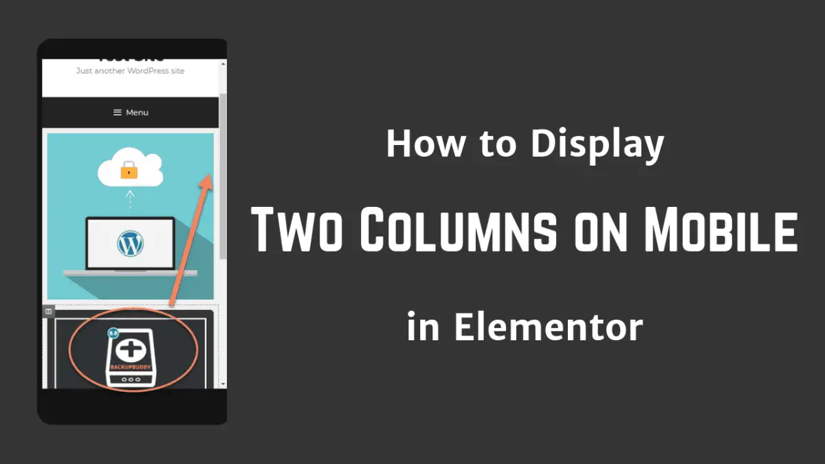
As a web designer, it's important that your website looks good on all sizes of screens.
Sometimes you need to display two columns side-by-side on mobile.
Elementor defaults to having columns be full width on the smaller screens.
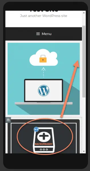
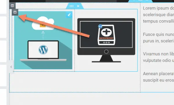
Usually that's what we want, but how do you get this dark image to sit up next to the blue image on a mobile?
How to display two columns on mobile in Elementor:
- Create your columns in Elementor
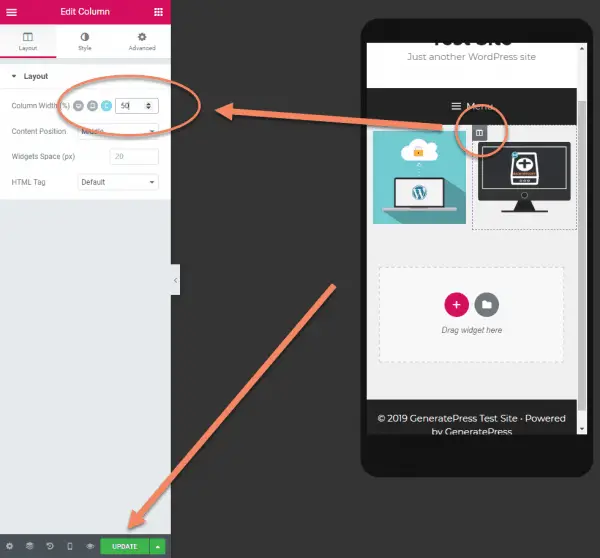
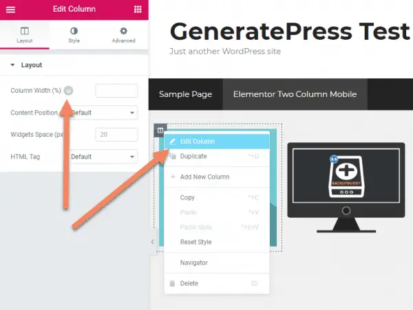
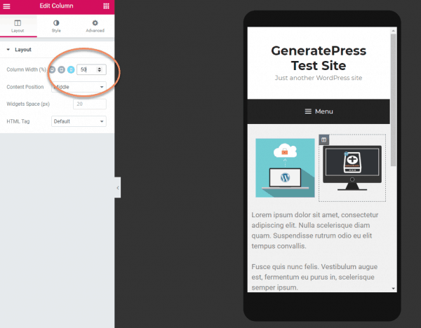
- Right click the first column and edit it
- Under Layout, switch the Column Width to mobile view
- Change the width to 50
- Repeat for the second column
- Click Update
The process is the same if you're using the Inner Section widget to manage your columns.
I'll show how to do this with the Inner Section widget below, for more control over layouts, but let's walk through the "normal" way first.
Make sure you have Elementor installed and active. See our tutorial here if you need help with that.
Add a new row and select the Two Column structure.
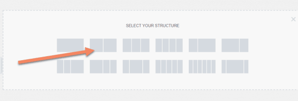
Add your content to the two columns.
For this tutorial, we're just doing two images, but you can put anything into the columns, as long as they will resize.
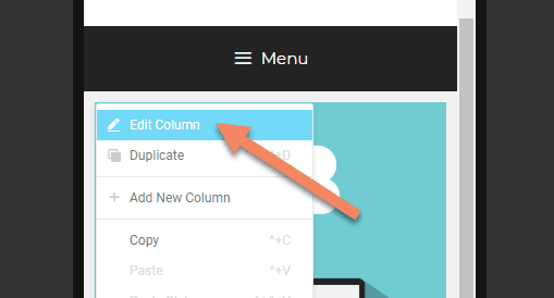
You need to Right Click the column icon. If you don't see it, just hover over the column.
We'll do the blue image column first.
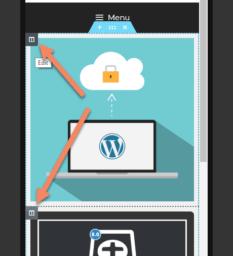
Left click "Edit Column".
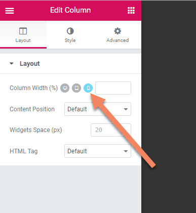
Click the desktop icon next to Column Width (%).
This will make visible the tablet and mobile options.
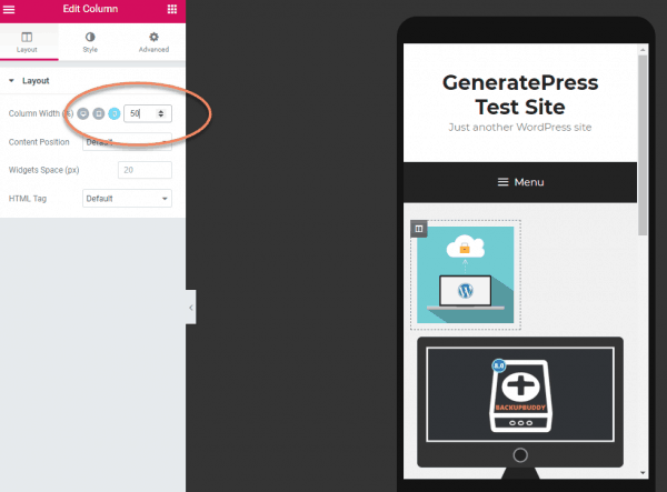
Click the mobile icon.
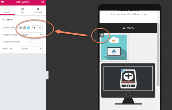
Enter "50" in the box next to the mobile icon.
Remember that this is in percent. So if you want the two columns to be 1/4 and 3/4, then you'd put "25" in this box and "75" in the box for the other column.
You don't add the percent sign. Just the number.
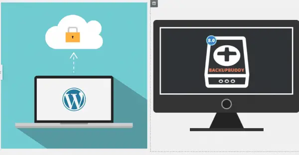
You'll see the first column change to half the width, with the second column still at full width.
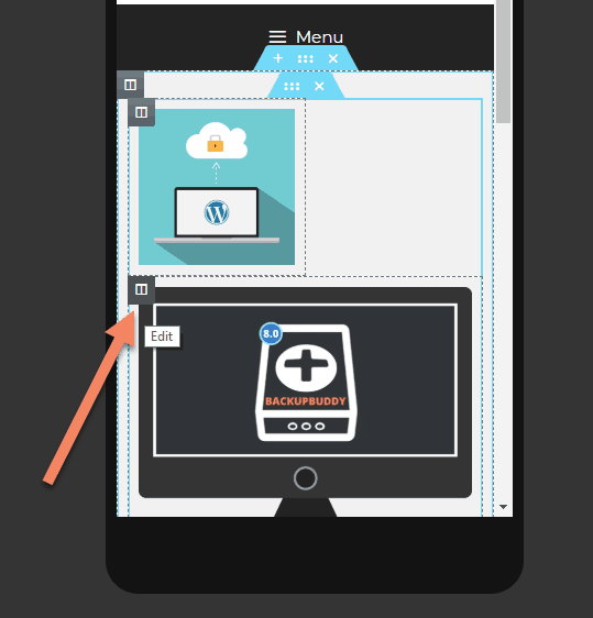
Do the same thing for the second column.
- Right click on the column icon for the second column,
- click "Edit Column",
- change into mobile settings (if it's not already in mobile settings),
- then enter "50" (or some other width percentage).
You'll see the column update as you type.
Once you're happy with the look, click "Update" to save your work.
That's all there is to it.
Now when you view the page on difference sized devices, it will preserve the two column layout.
You can use the same method with three or four column layouts.
I don't usually recommend having more than two columns displaying side-by-side on mobile. It's better to let the content "breathe" with a bit of space.
You might do a four column side-by-side on mobile if they're something like FontAwesome icons, maybe as links.
How to display two columns on mobile with the Elementor Inner Section widget
For this example, we're going to work with a layout that has two quarter-width columns and a half-width column.
Our plan for mobile is to have the two quarter-width columns become two half-width columns and the half-width column become a full-width column.
The concept will be the same as the previous example, but the steps will be slightly different.
We start by setting up a new row with two columns.
Then we add the Inner Section widget to the left column.
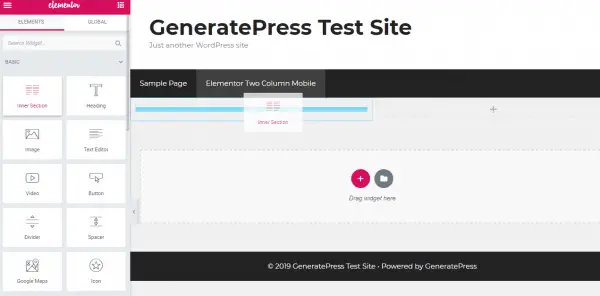
We add the content to all three columns.
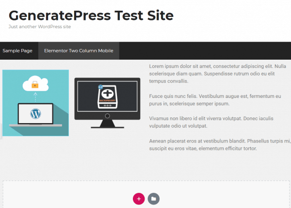
For continuity, the two columns in the Inner Section will have our two images, in the same order.
We put a text box in the half-width column.
This tutorial applies to any combination you like.
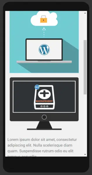
As you can see in the image below, Elementor defaults to the inner sections becoming full-width.
We want that black image to sit next to the blue image.
When you hover over the blue image, you will see the column icon for the column, as well as the column icon for the Inner Section.
Right click the column icon for the Inner Section.
Click "Edit Column", then click the desktop icon next to Column Width (%).
Choose the mobile icon and enter "50" into the Column Width box.
Hover over the second Inner Section widget column.
Right click the column icon, then choose "Edit Column".
The mobile icon should still be highlighted, but if not, click that.
Enter "50" into the Column Width box.
Now you see the images sitting nicely next to each other, with the text underneath.
Click the green "Update" button at the bottom to save your changes.
I hope you found this tutorial useful. Now you know how to display two columns side-by-side on mobile in Elementor.

Man, thanks a lot!
Cheers, this helped alot :)
Thank you! I was close to crying, I swear, until I found your post about this. So simple once you know, right?! Thank you!
Yeah it's not terribly intuitive, is it? I think I stumbled across it when I was looking for something else. Glad it helped!
Hi Mike,
Any chance you can help me again?! I had the multiple columns working on mobile after reading your tutorial. But now it's gone back to one big fat column on mobile - both tablet and phone view. I don't know why. I have followed your exact steps again. But I can't get it to go into 2 columns on mobile. Have you ever had it 'stop working'??
Terra
I have the same issue now... I don't know what to do
Thank you very much!!
Well works for single stuff. But the gallery is still stupid as hell. No change possible without hacking to show different columns amounts depending on the display size...Jeez I loved to make pure static html/css.
I'm not very good with building a website or so, so when I ran into this problem I was a bit devastated because I came so far and now I needed to make the pictures on the mobile theme smaller. I found your article, I gave it a try, within 2 minutes I transformed my whole mobile page. Holy moly. I just wanted to leave a comment to say thank you and to keep pushing, you're amazing!
Hi again!
A few weeks ago I asked again for help with columns. But I figured it out! I was using Safari (which I had used all along) but then learned somewhere that in Tablet view, Elementor columns don't always reflect the changes. So I was doing the right steps, and the changes did work, BUT the changes weren't showing up when I looked at 'Tablet View', in Elementor.
I looked on my iPad, and the changes are there. So now I use Chrome when I am making changes to my website. Seems to work better, for seeing changes in Tablet view.
Terra
OMG THANK YOU. I thought I was going crazy
thank you !
wow its really help , thx
Thanks a ton man! Really helped a lot.
I am usually not commenting but your tutorial on this is simply awesome! Thank you so much my friend!
Dziękuję bardzo. Thanks for your kind words, Pawel.
Thank you for sharing it. It worked
Wow very easy, thanks bro :D
seriously i just read starting 4 points and it helps me thanks dude
Brilliant. Glad it helped.
I have tried changing the layout of mobile view. But it's not working on my site. Can you please advise me sir ?
It could be a caching issue, or it could be that other code is overwriting it.
I'd start by using Inspect Element to find whether the code is changing as you resize the browser: https://intelliwolf.com/find-code-using-inspect-element/
Failing that, switch to a default theme and disable all the plugins other than Elementor: https://intelliwolf.com/how-to-fix-wordpress/#disable-plugins-default-theme
Obviously be sure to backup first and don't try it on a live website.
It really helped. Thank you very much!
so much thx brother
Dude you rock! Thanks a lot for the guide.
Thankss!!
Thank you very much. Fixed a headache problem.
Thanks It helped me to make downloads page user friendly for mobile users.
Thank you! Great Job!
The right thing that I want really helpful content
Just what I was looking for!
Thanks,
You are just awesome. I was scratching my head and trying to figure out how to do and you made it very simple. Thanks a lot.
Thanks, Man
You are the best.
you are great man love you bro incredible
Thanks a lot.
This is what I was looking for.
Muchas gracias, ya perdí la cuenta de cuántos días llevaba tratando de hacer eso
damnnnn, ive been through like 10+ post on how to add two columns .i was trying from so long, literally the only post i found which helped!! i never comment but this post deserves it!
Oh my goodness... This helped a tonne, thank you SOOO MUCH!!!!!
Would this also work if you'd like to do something other than 50% - 50% for each image? For instance 30% for the first image and 70% for the second image?
Yep, as I mentioned in the article, you just need to make it add up to 100% or less.
Amazing thanks so much! But one thing....After doing the 2 side-by-side columns, I tried adding an icon list to each, but it looks really messed up on mobile...any thoughts?
Thanks again for the article!!
thank you so much, it solved it.
What....! And I've been messing with clients project all these while with icon boxs showing 1 per row.
This is the most important guide I have seen.
Thanks A Ton 💖🔥🔥🔥
Thank you. sooo much easy easy tutorial
thank you so much. but it dosent work on tablet!
I have never commented on blogs or articles, but THIS was amazing! THANK YOU SO MUCH! Having to bring two elements together seemed impossible, very well-written piece. Following your blog!
It's 2021 and you're still a GOD!
it is really great and useful, straight to the point and will crafted tut, thank you Mike for spending time to share this trick
It helped. Thanks
obrigado me salvou
Thanks a lot! Great info!
Buddy, You have saved me soo much trouble that i cant thank you enough...
Hi, Mike.
I just came to say thank you. Nice tutorial.
Thank you for this post
I have gone through the whole tutorial.
I am a beginner.
It had been very helpful.
Thanks a lot. You are wonderful.
Love from India.
Thank you very much, it has helped to change my site's designed drastically.
thankssss
Thank you so much!!
Thanks much buddy! your instruction is too perfect!
This was so helpful, I couldn't skip the comment and thank you.
Same as all the other comments, I was fiddling around with my elementor columns for 15 minutes and couldn't get it, thanks so much for making this quick easy guide!
Awesome and well delivered, worked like magic, Thanks for the time.
Ohh thanks, i found it 😃, First search with first satisfied result.
This saved me lots of time and frustration. Thank you so much for the tutorial and offering the easy fix right in the beginning of the post.
a mere 5 mins on your website could have saved me days of fighting to make my website responsive
Thank you for posting this. it has been a huge help
Thank you so much for this guide. This was exactly what I was having trouble with and this allowed me to keep moving forward with my design