There are times when you need to hide a column on Elementor for mobile or tablet devices. This is not something that Elementor shines at, and implementing it is a little counter-intuitive.
How do you hide a column on mobile or tablet in Elementor?
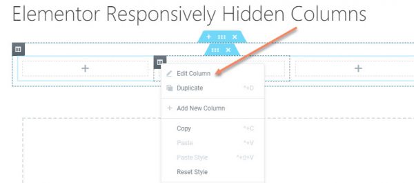
- Right click on the column,
- Click Edit Column,
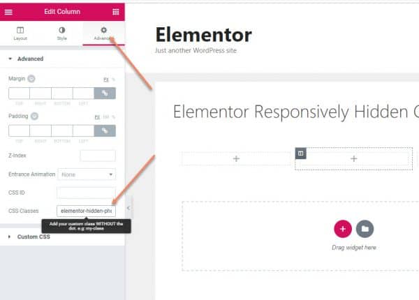
- Select the Advanced Tab,
- Add elementor-hidden-tablet or elementor-hidden-phone to the CSS Classes
- Click Update.
Let's walk through that, step by step.
If you're wanting to hide specific elements on Elementor, as opposed to hiding columns, see my tutorial on that here.
I've written an in depth tutorial on how to do responsive column ordering on mobile for Elementor here.
If you don't have Elementor installed and active yet, see our tutorial here.
Start by adding a row with the number of columns you want...
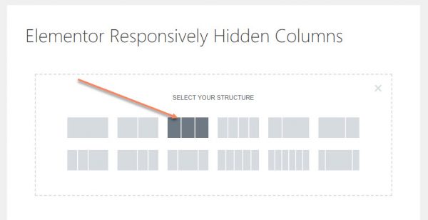
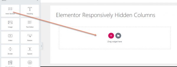
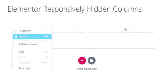
Alternatively, add an Inner Section and duplicate a column until you reach your desired number of columns...
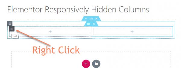
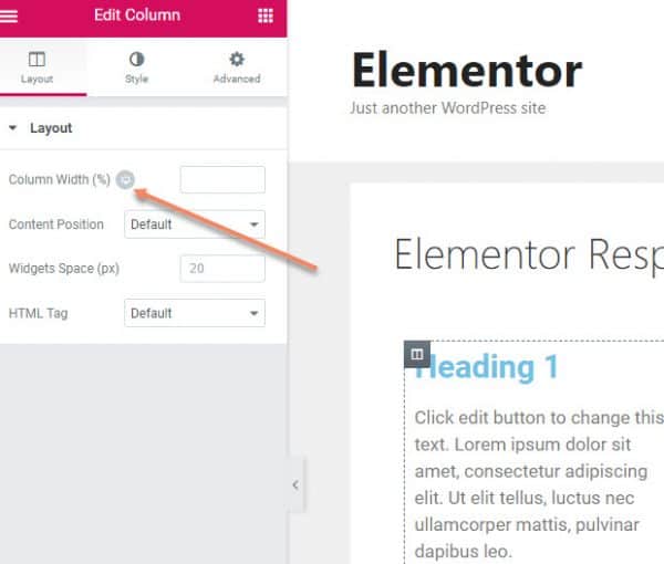
Regardless of which method you use, the next step is to right click the grey column hover, then click Edit Column.
Go to the Advanced Tab and look for the CSS Classes. In there, you'll enter one of the following:
- elementor-hidden-desktop
- elementor-hidden-tablet
- elementor-hidden-phone
Each one will hide the column on that specific size of device.
For example, if you want to hide the column on mobile device, you would put elementor-hidden-phone.
One problem is that, because the CSS that allows this responsive column hiding runs after the preview, the column won't actually be hidden if you change to the preview for that size...
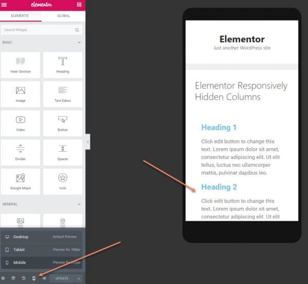
Hopefully this is just a bug, and they'll fix it at some point.
To see if it has worked, go to the front end for that page (click the eye icon next to the green Update button)...
Then resize the browser window to see the effect. I do it with Inspect Element in Responsive Mode on Chrome...
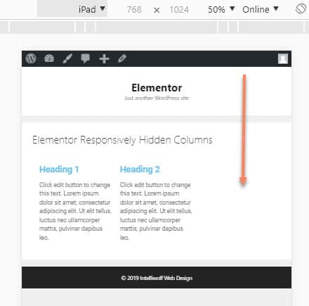
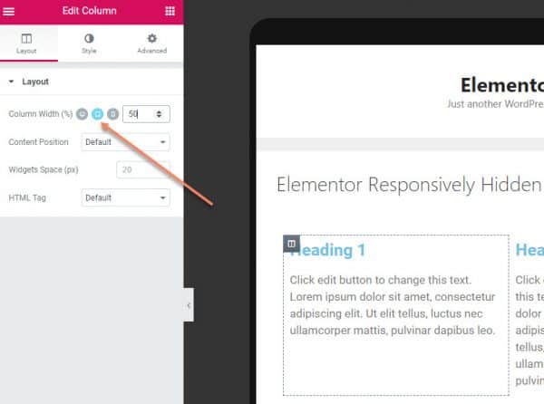
Notice that it literally just hides the column. It doesn't compensate widths. The way to fix that is to go back into the Elementor Editor, edit the columns that will be visible, but change it to responsive mode...
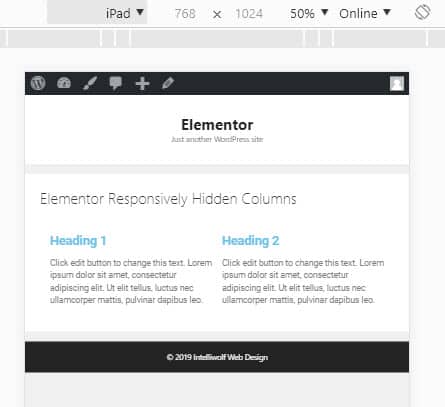
Here I'm changing the two columns that will be visible on tablet size to 50% when viewed on tablet...
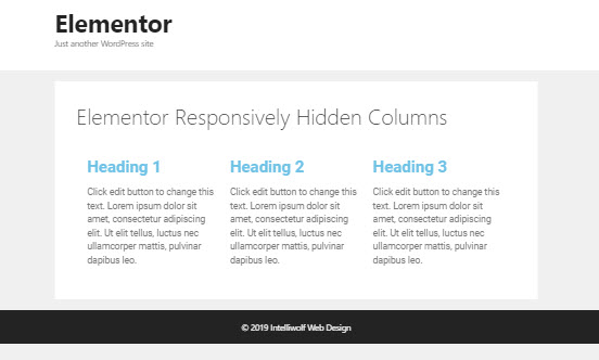
And this is how it looks...
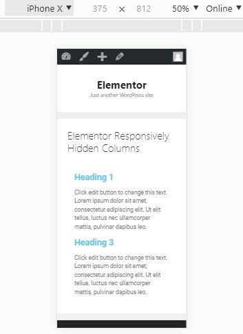
If you hide the column on tablets, it will still be visible on mobile. I think that's best, because it gives us greater flexibility.
If you want to hide a column on both tablet and mobile sizes (ie anything smaller than a desktop), you add both sizes, separated by a space, like so:
elementor-hidden-tablet elementor-hidden-phoneNotice that you can also hide elements on desktop, by using elementor-hidden-desktop. This will be especially useful if you're designing for mobile first.

Hi there,
Do you know how to hide a section in elementor when the viewpoint width is 1024px wide(iPad)
And also how to only show a specific section when the viewport width gets yo 1025px wide and above....
I have been searching for how to do this in elementor/ elementor pro and cannot find anything out
Any help or advice would be a lifesaver!
Hey Carlos.
I've got a whole tutorial on that here: https://intelliwolf.com/responsively-hide-elements-elementor/
To only show a specific section when the viewport is larger than 1024px, you would hide on tablet and mobile, but leave it visible on desktop.
Hi Mike
Thanks for that tutorial. I'm just trying out Elementor, and I was trying to build a three column layout and hide the first and third columns on tablet and mobile. You explained things very clearly.
The one thing that seems to have changed since you wrote the tutorial is that Elementor has added a Responsive setting for Columns and other elements, with toggles allowing you to Hide on Desktop, Hide on Tablet or Hide on Mobile. Perhaps you could update the post to reflect this?
The setting does say that "Responsive visibility will take effect only on preview or live page, and not while editing in Elementor." so it doesn't look as if they have solved the problem you indicated.