Your web design layout will often call for full width rows.
By default, Divi rows are set to a maximum width, usually 1080px.
There are two main ways to get that full width look:
- Set the background color on the section, instead of the row
- Change the width and max-width of the row
You'd go with the first if you wanted to keep your content boxed in the middle, but wanted the feel of full width.
You'd go with the second option if you wanted your content to go the full screen width.
Set the background color on the section
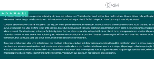
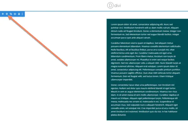
Hover your mouse til you see the blue section controls, or find the correct section in the wireframe editor.
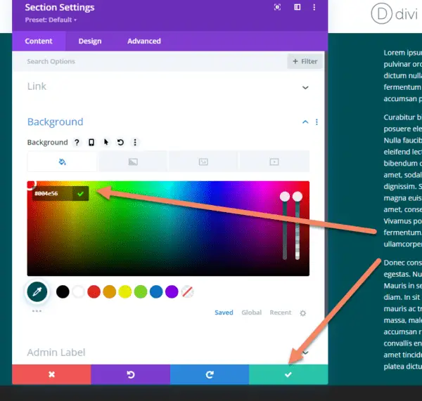
Click the gear icon to bring up the section editor.
Change the background color to match your look.
Once you've saved the changes, you'll see a full width colored section with the content in the middle.

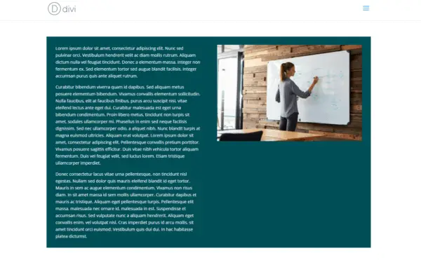
Change the width and max-width of the row
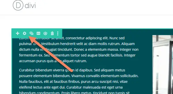
To change the width and max-width of the row and allow it to stretch to the edge of the screen, hover over the row until you see the green edit row controls.
Click the gear icon.
If you're using the wireframe editor, find the correct row and click the gear icon.
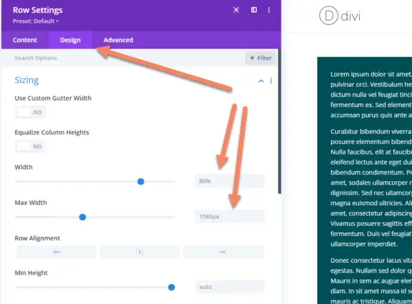
On the Row Settings modal, go to the Design tab and look for Width and Max Width.
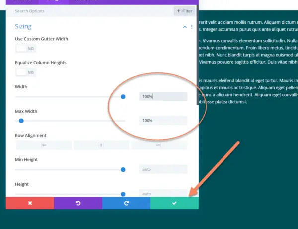
Change both Width and Max Width to 100%. Save your changes.
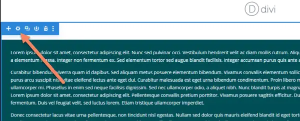
Now the row will stretch the full width of the screen.

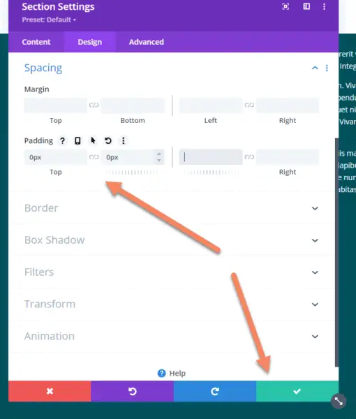
Divi puts padding into the sections by default, which might leave incorrect gaps.
You may want to remove them. To do so, hover over the section until you see the blue section controls. Click the gear icon.
In the Section Settings, go to the Design tab. Under Spacing, change the Top and Bottom padding to 0.
Click to save your changes.
Now your row will push right up against the top of the screen or the previous section.